Saturday, 2 April 2011

Nissan Turns Over a Social Media Leaf

To view the article, click here.
Nissan has chosen to employ social media as part of its marketing strategy to launch its new Nissan Leaf 100% electric car.

To view the Nissa Leaf Facebook page, click here.
Nissan has done a super job at creating a meaningful and relevant brand experience through this social media vehicle.The brand is capitalizing on cause/advocacy marketing where they are providing an outlet for fans to donate to the Japan crisis. This is going to be something that the target audience strongly values considering the product that they are selling is tied to strong social issues. The Leaf's slogan is "Innovation for the planet" and not only does this relate back to the Nissan brand’s mantra of innovation, but it also shows consumers that they are buying the car to support the world rather than just buying the product for themselves. Social media is a great vehicle for this product introduction because these fans and followers are typically going to be very passionate people who are strong advocates of social issues and who want to debate and discuss things. This will not only be meaningful to the consumers but will also result in positive brand messaging on these outlets and will increase the chances of positive word of mouth.
   
This social media platform is also a way to build a relationship between the brand and the consumers. In a sense, the social media coordinator embodies the Nissan brand personality, so theoretically, the consumer will have the opportunity to interact directly with the brand itself.

A sample Facebook post from the brand:
"Trees are awesome – run out and hug one right now and have a look at some of the most beautiful / strangest trees in the world."

This post was very strategic in it’s friendly, environmentally focussed personality as well as building brand associations of trees that link seamlessly back to the Nissan Leaf brandOn all of these communications, there are strong links back to the Nissan corporate head office as well as the “Built in America” messaging. I think this is appropriate because Nissan has done a great job at managing their brand in the recent past and should leverage this corporate name brand (by showing what their innovative head office looks like) to be consistent with the innovative and quality imagery.

Overall great job NISSAN! It's a great marketing program: Clear, relevant, distinctive, and consistent and is likely to result in  positive consumer mindset, ultimately translating to shareholder value.

The Wonderful World of Brand Cues

It's interesting to note how heavily some brands use cues in their marketing communications. Prior to some of my marketing classes, I underestimated how strategically planned out each of the items that appear in a commercials actually were. I thought they were haphazardly chosen, but there is actually so much more thought put into the colours, shapes, sounds and objects placed in commercials than I previously understood. Some great examples:

Bud Light:

The aliens, blue colours, signature wardrobe style, same cheesy facial expressions and sense of humour, and consistent appearance of models all suggest Bud Light. You know this is going to be a Bud Light commercial almost immediately, far before the products or logos are shown. This is because these elements are used very consistently across all marketing communications so you know what to expect from a Bud Light commercial.

Febreeze: 

Blue is a common theme in this ad: The cushions, eye colour, blue curtains, bags, pictures on the mirrors. Basically in every frame of the clip, there are blue cues that link back to the colour of the Febreeze packaging as well as the Febreeze brand logo, name, and wind whisp. Another important cue used throughout Febreeze ads is the signature whistling noises and musical theme. In this regard, even if an individual watching the commercial loses attention midway through or completely misses the commercial all together, they may still get the Febreeze brand exposure through hearing the whistling or music, or by seeing many of the brand cues littered throughout the ad.

Cool BMW Commercial

I really liked this ad:

I think this is a really strong ad that demonstrates the luxurious, exotic and top quality sensation that BMW wishes to communicate as its brand promise. It's an interesting concept that inspires you to be the best that you can be and that if you set your mind to it you can accomplish anything. This is in line with the BMW brand since it markets extremely self-expressive products and this ad inspires the idea that by driving a BMW, you will be successful and achieve the things that you want to achieve in life. It also suggests that we are all humans on a level playing field, but it is what you do with your life that determines who you will be and that your success is a function of your own actions and mindset.

Coors Light Bullet Train Express

There was a great experiential marketing event when I went for a night out at Laurier's Turret Nightclub recently. Coors light had sponsored the night and lowered the prices of Coors Light products for the night. There was also an area set up on the stage that had a booth set up like a train ticket booth where you could get your Coors Light cans chilled on ice. There was also an area on stage where you could take poker chips and bet on where a spin wheel was going to land (similar to roulette). If you bet correctly, you win a prize! I ended up winning and chose a snowboard bag (retail value was probably $100+). There was also a countdown for the grand prize draw at midnight for a unique prize.

This was a great way at building a brand experience that was relevant and meaningful to me particularly because I was also interacting with this product all that night since they were cheaper, adding value to the whole experience. It also introduced me to a fairly unfamiliar element of the brand, the Coors Light Silver Bullet express train. It was a fun way to get me involved and make me remember and associate that positive experience back to the brand .


Gucci Guilty

As I watched TV the other day, I noticed an ad for a new perfume called
Gucci Guilty. The communication shows one girl questionably cheating on her
partner and then takes a breath of guilt as she stands on top of a skyscraper at
the end. Here's the ad:


I was confused by this message and the fact that it was promoting adulterous
behaviour so decided to see what the Gucci brand was all about. It turns out
that Gucci in fact has quite the history of controversial marketing messages
and has caused a fair amount of consumer uproar in the past. I stumbled upon
a website that contained a collection of controversial ads and Gucci seemed
to dominate it. 

After a little more analysis, I understood that this is what Gucci is all about.
The brand has always been one to push the envelope. Gucci has always
maintained a forbidden sense and hasn't been afraid to get in trouble. It's a
fearless brand. In this regard, Gucci's target audience is likely to be very
receptive to these bold types of communications. The target market
sees fashion as pushing the envelope and would not expect Gucci to do
anything conservative in it’s actions. Gucci displays a "Break the rules"
leadership approach with all ads being relatively innovative and unusual. This
leads back to the core brand values of breaking the rules, being forbidden and
fearless. This is very much an identity brand that users purchase to help
express their ideal self concept. They see the gap between their current self
identity and the brand’s target profile as displayed in the ads.

Although this ad positively helps to build the fearless and forward Gucci
brand, there are some moral and ethical considerations here. Brands like
Gucci need to be conscious of the boundaries between what is acceptable
brand building marketing and what marketing messages should not be
promoted to the general public as they are a source of many social issues. In
this case, I think Gucci's actions are still acceptable because the ad is subject
to interpretation and lacks explicitness. Whereas if the brand explicitly shows
the woman cheating on her partner in an obvious manner, this ad would be
unacceptable and could face a large backlash from the general public.

Another famous controversial Gucci ad from the past:

Friday, 1 April 2011

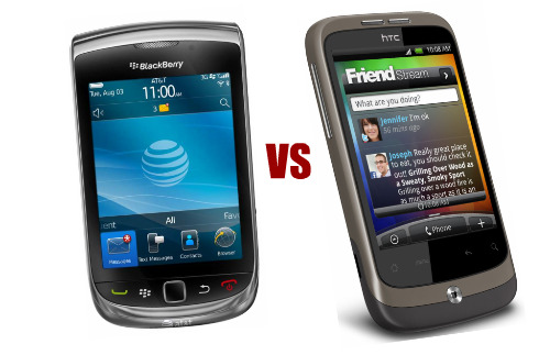
Blackberry vs. HTC

So I decided that it was time to upgrade from a pay-as-you go plan to a contract plan and decided that I might as well upgrade my phone as well. My friend owns 2 bell stores and is proud of the Bell brand and talks about it positively any chance he gets. In this regard, I was comfortable dealing with Bell. My brother had also experienced Bell service before and was satisfied. I heard bad stories with Rogers and Telus so decided that Bell it was.

Now, which smart phone should I choose?


HTC: I like the commercials and feel that I fall within and can relate to brand’s target market. I can relate to the free-spirited, individual and creative brand personality that the brand promotes and have always viewed the brand in a positive light. To me the brand is optimistic, an underdog, modest, high quality and fun so this has really resonated with me. I also strongly liked the phones available, particularly their design and aesthetic appeal.

Blackberry: The brand community that Blackberry has built is so strong and had the biggest impact on me. Although I felt a stronger connection to the HTC marketing communications, it was the social influences and word of mouth recommendations from friends that ultimately compelled me to join the Blackberry movement. The biggest selling features for me was BBM and all of the great stories associated with using BBM. Another feature that attracted me to Blackberry was the connection that it has to the parent company RIM: It gives me a sense of pride to support a local, home-grown, multi-national company that is down the street from my university. Blackberry’s large “Do what you love, love what you do” brand equity building campaign that aired last year also established this idea in my head that when I was going to upgrade to a smartphone, this was the phone that I was going to get.  I could relate to this campaign and it felt uplifting and encouraging, which helped to fulfill hedonic needs. Just the fact that I have grown up knowing about the blackberry and seeing how much it has improved in quality and features over time was very appealing to me.

I ended up getting the Blackberry Torch and am very happy with my purchase J

Evaluating Adidas All In Campaign

For an article on the new ad campaign, click here.

The Rationale behind this campaign was that kids these days mash everything together
so in a sense mashing all of the target markets together (skate kids, athletes and fans of
fashion and music) into one big campaign where everyone can relate in some way or
another with the concept should work. It's based on the notion that if you are
passionate about something, you will fully commit and go "All In". 

The complete ad:


I really like this ad and I think this does a great job at capitalizing on some of the segments that potentially weren't sure if they fit with the Adidas brand or not. For example, I am no athlete or skater, but I am a fan of music, fashion and being trendy so this was a great way to capture my attention and make me think about Adidas the next time I think about clothes. Another key feature that was done effectively was to focus on each of these core groups fairly equally. Had the ad focussed less on their core target group of athletes, the message may have been lost some where along the way. There are also strong ties with victories and persistence which is key to the brand’s core value. This does a great job at influencing the mindset of the consumer: It takes a very different approach than other athletic apparel companies have used in the past so does a better job at breaking through the noise. This is likely to result in much higher awareness and recall and also builds a huge number of new and highly relevant brand associations like Katy Perry and David Beckham. One thing this ad really excels at is increasing the breadth of awareness. It does a great job at increasing the number of situations that an individual may have top of mind awareness for this brand. For example, prior to this ad, I thought of Adidas only in the mindset of athletic products but now view it more as a fashionable clothing brand.

Budweiser Product Placement

It's interesting how much more you notice product placement on TV the more and more marketing classes you are enrolled in. One that I have noticed in particular is Budweiser and its ubiquitous presence on many sitcom shows, for example That 70s Show and the newly acclaimed Mike & Molly. It's also interesting how much more I questions WHY these products are placed in these types of shows.

Here is my assessment: These shows are great fits fits with the brand and helps to showcase the target profile of the brand user. These shows feature the traditional American families and values, living the traditional “American dream”, growing up in suburbia, having average jobs and enjoying the relaxed American lifestyle. The Budweiser brand itself is centred on these strong American, patriotic, historical and nostalgic values. Particularly by featuring the brand in that 70s show, it brings back feelings of nostalgia to when the days were much easier and care free. It’s known as the “Great American Beer” as marketed in the United states. Another interesting observation to note that it is positioned as the “King of Beers” in the Canadian market, which is a British monarch and looks more fondly on the concept of kings and queens. Also, these shows are based off of humour and expresses the idea that when you drink a Budweiser, it’s fun and carefree and showcases that if you live this traditional American family lifestyle, then Budweiser is the beer for you.

Just an interesting video on product placement, focusing mainly on Budweiser:


P&G features future friendly products for earth month

To read the article, click here.


P&G's efforts to go green seem much more realistic than many of the other companies trying to slap the “green” association on themselves. P&G does a great job at linking this family of products back to the corporate brand by being completely transparent. In addition, credibility is added through the company taking numerous strides to be a sustainable company with announcements a few months ago that it wishes to be completely sustainable in the foreseeable future.

In this case, all of these products are designed save water, save energy and reduce waste. Since consumers are now often buying the company more than the product, this is a great way to leverage the valuable P&G brand similar to how other parent companies are capitalizing on this transparency. For example, SC Johnson, Reckitt Benckisser and Unilever all displaying their corporate logo on any connected communications. This is a g reat way to leverage the strong parent company brand equity. This is also on trend with advocacy marketing which is highly valued by consumers these days as long as it’s credible and the company is not seen in a hypocritical. Given P&G’s drastic and voluntary commitments to environmental sustainability, this is likely to be believable in the eyes of consumers. Although, this is no longer a point of differentiation because it is now just expected that companies embrace the "going green" movement. Corporate brand equity is also being built in this case where all of these brands are all feeding off each other. They are all power brands - when you think of P&G you just think of power brands when they are batched together like this, which makes P&G seen in a more positive light. 

Rogers Speed Challenge


While attending the annual home show in Toronto at the Direct Energy centre, I was bombarded by a number of brand initiatives. Most of them were just lost in the clutter but one that really stood out to me was an experiential Rogers booth called the "speed challenge" where people could go and sit down and eat their food that they purchased from food vendors nearby. This area also played loud, upbeat music, with songs that catered to the generation Y age cohort. In this booth there were rogers reps that were there to answer questions and talk about the brand but this was not their biggest emphasis. There was also a huge  ice rink with people skating on it where you could try the “Speed Challenge” where you had to shoot the puck into a small hole to win a prize. 

This created a fun family experience and a fun experience for potential new home buyers and recent home buyers. This was strategic on the part of Rogers as this market is likely to be searching for phone, TV and internet services. Since rogers is mainly a home service, this is consistent. Brand elements, cues, and associations that were added included the Rogers trademark colours and references, home comfort, eating at home, listening to music, upbeat music, outgoing sales reps, young and youthful spirit, speed, hockey and Canada. The name "speed challenge" itself links back to the brand strongly because this is Rogers' main positioning platform and reinforces the idea that Rogers in fact associates itself with speed. Although the Rogers brand is basically the worst brand in Canada, these efforts do help a bit. Even though people do not like the brand, they will at least see the brand as having a fast network.

Brand Loyalty at its Finest

My dad has to be the most loyal customer in the world to the local Esso gas station. Every opportunity he gets, he will try to promote the store positively and refers people there for almost anything they ask for. My dad has developed a great relationship with the two owners over time and has become loyal to everything that the stand for, particularly coffee (after switching from several years of brand loyalty to Tim Hortans). He will always recommend Esso as a first point of shopping for anyone asking where they can get convenience goods.

This just goes to show how strong of an influence a brand community can have on purchase intentions of consumers and how powerful and productive brand evangelists can be in building brand equity and brand trust. This also shows just how valuable some customers can be to certain brands and suggests that brands should put a heavy emphasis on retaining these passionate followers as opposed to acquiring new, less valuable customers.


Thoughts After Reading Primal Branding: "BIG DAVE" Sub


Upon reading the book Primal Branding by Patrick Hanlon, I was intrigued by the concept of phenomenology and it reminded me of my experiences working at Mr Sub. The other day on my shift, a fellow coworker brought up the “Big Dave” and had stories about it – I had no idea what he was talking about when he said "Big Dave" and he was surprised that I hadn't heard about it before.

Big Dave’s creation story was that a past employee, Dave at Mr. Sub always made the same custom sub every time he had a sub. It was a decadent combination of santa fe spicy chicken as well as a ultimate cheddar club – two huge meaty subs combined into one very expensive sub.

Word got around the workplace until the staff of Mr. Sub started to actually buy this sub on break at a discount. Dave had a very outgoing nature – he tried to actually sell and market this product to customers during a conversation. Now other employees are also doing the same to make work more interesting and challenging to make the sale.

Other elements of the primal code observed:
Creed – A very meaty and satisfying sub, you wont get anything more excessive to fill your extreme hunger, loaded with calories and is actually disgusting looking
Icons – the Mr. Sub Panini grill, the “OHHHH” sounds of all people in the line, foot long, tall sub, messy counter, football team, men
Rituals – It's an unwritten rule that you must get it grilled on the Panini press because you almost have to in order to shrink it’s height to fit it in your mouth, people being disgusted in line, laughing in line, asking questions and sparking curiousity of other customers, waiting to see people’s reactions
Pagans or Non-Believers – Regular subs, disgusted and appaled people in line preferring a healthier alternative
Sacred Words – “Big Dave”, grill
The leader – Now Adam, a new shift leader has been strongly advocating the sub and wanting to make it a special option only available at Laurier and has been nagging management to add it to the menu as a joke

The Big Dave has truly been a Success story – Now we all think it’s legendary, the football team are now loyal buyers and have been hearing it through Word of mouth – it has not even been advertised and it isn’t even on our menu at all! This goes to show that you don’t need to advertise to actually sell a product, a great product sells itself if it contains all of the elements of the primal code. It will be interesting to see if this actually catches on and becomes a special Laurier phenomenon. This also goes to show that the employees need to really believe in the product and be passionate about it to actually sell it. It is a contagious phenomenon. When peoples friends buy the product, people usually crack and buy the product as well, sometimes they have to wait and see what it looks like before deciding. Often people request the Big Dave in a sneaky manner or say the “Big sub” as if it’s a secret and an exclusive product. They feel special and good about themselves by being part of this exclusive Big Dave club.

Beauty Brands Jumping on the "For Men" Trend


While in the shower, I decided to analyze the products that I use and the names of the products in particular. The concept of brand architecture came to mind right away because these names of the products appear as simply and obvious, but there is actually a lot of thought going behind it.

For example, I use Dove Men+Care body wash. Here's it's architecture:
Company Name: Unilever
Family Name: Dove
Brand Name: Men + Care
Modifier: Clean Comfort (Mild Version)

This name leverages the dove brand while also tying it back to the parent company, Unilever through a symbol on the back of the bottle. This allows this product to leverage all of the positive brand equity of Unilever through some of its other products that the consumer may have used and associated back to the parent company.This also clearly positions the product as a men’s product which is highly effective in the health and beauty category because through my experiences, men often get frustrated and deterred from searching for these types of products in stores that they are unsure of whether or not they are shopping for a men or women's product. Another product in my bathroom is Nivea for Men aftershave which also clearly identifies itself as a men’s product. On all commercials for dove, the Unilever icon is also shown which helps to leverage the strong brand reputation of the company. The brand modifier was effectively chosen and helps to emphasize 2 benefits without any explanation (just simply in the name): Getting clean and also being comfortable. One suggestion though is that they should have refrained from using "Mild Version" as a modifier because this could be detrimental when men perceive the other products in the collection to be non-mild and perhaps have the connotation that it is harmful to you skin. In this regard, this should be either removed or replaced with another modifier like the flavour or the scent.

Referring back to presentations in brand communications class, the team performing a brand Audit on Aveda recommended to keep the brand name the same while expanding to appeal to the male market. I disagree with this and think that they should add a modifier like Aveda MEN. This will help to fine tune the image rather than building equity but it would succeed at ensuring these male buyers are willing to look at your products comfortably, with no doubt that they are browsing women's products. I think many marketers underestimate how strong of an influence these modifiers can actually have on a brand and should think much deeper about these modifiers.

Nissan Leveraging the Power of Sound

I recently noticed that Nissan has added a new brand element to its collection. Being a marketing student, I am very vigilant of these types of brand changes but for the typical consumer, it is likely that they did not even notice! Nissan has now added a sound effect to go along with the flash of its logo at the end of commercials. The sound is very futuristic and robotic and is well aligned with the newly found brand values of innovation. This is a great use of stimulus marketing helping to associate the brand with technology, the future, and innovation. It sounds similar to the noises that PlayStation uses when you start a game. Nissan has created one more way for consumers to remember the brand by. Think of how powerful Mac Book's signature turning on sound is and how much value it has added to the brand? It's a wonder why all brands don't jump on the bandwagon of stimulus marketing in efforts to appeal to ALL the senses to build a more memorable brand. 

New Ford Explorer Commercials are GREAT!


Ford has made a huge come back in the past few years. Once an inferior quality and sub-par car brand, Ford has repositioned itself as a quality, technology, fuel-efficiency and design leader. I was really impressed with the launch of the new ad campaigns for the newly designed Ford Explorer that premiered during the super bowl. The music is very empowering and inspiring and the entire commercial is filled with uplifting messages that makes you want to go explore and get the most of life!

This ad does a great job at building a brand personality for the explorer. It incorporates people having tonnes of fun, exploring, travelling, going on road trips, enjoying their time here on earth and genuinely living a great life. This commercial really affected me because this appeals to my ideal self-image - someone who wants to travels all across the world, embarking on great adventures, having really unique experiences with the ones that I love and having a great time doing it!

There are plenty of brand cues used – for example the inspiring Indy music is consistent across all of these ford ads in addition to the "GO FAR" referencing so you understand that it is a Ford commercial before the brand is even shown

Another observation with this ad as well as other car company ads is the brands localizing their ads to different geographic consumer segments. For example, the Ford ad shows constant outlines of USA on the map in the American version of the ad or outlines of Canada in the Canadian versions.

A lot of other car companies leveraging this “built at home” aspect and are trying to instill pride and patriotism. I have noticed this in many different different car companies for example Chevy Cruze and BMW X3 emphasizing the fact that they are built in the USA. The BMW ad states that even in the height of the recession they built the new plant in southern US and now all X3s are built in the states with pride. Another noticeable trend in the car manufacturing industry is the emergence of European style cars. This may be because consumers are shifting focus towards quality and European cars have always been associated with higher quality that lasts.

Gym, Tan, Laundry


The cast and producers of Jersey Shore do a great job of establishing likeable and memorable brand elements, particularly through phrases, famous words and iconic references.

One of the most predominant phrases used is "GTL" meaning Gym, Tan, Laundry (the routine that precedes going out and partying hard at the nightclubs of J-shore). This is a very specific reference and the target audience finds this very amusing - so amusing that people use it in their everyday lives. This benefits Jersey shore because this reference is only associated with this particular TV show and brand. No other brand employs this reference.

The character, "Snookie" does a great job at building a brand: One that revolves around drinking and acting completely mindless at all times (one that the target audience absolutely loves!) She constantly refers to pickles and other foods that she strongly advocates and has even picked up a gig endorsing things like pistachios.

In a sense, J-shore has created their own language. Other iconic elements that have been established include the  “smooshing”, “grenades”, T-shirt time" and "Cabs are here" which are now used in generation Y everyday conversation now and when are used, they evoke thoughts and associations with jersey shore. 


Bieber Fever - Just Keeps Coming Back!

Justin Bieber is legendary at building an impressive brand empire. 
Bieber is set to open up a retail store in LA featuring sneakers and lollipops later this year in addition to a highly successful 3D movie Launch featuring himself of course.
In my opinion these are appropriate extensions to the Bieber brand at this point and will be well received by his target market... But he won't be young forever and all of these icons he's creating may just be inconsistent with his brand as he gets older. As of now he is well positioned with appropriate symbols and associations but will he really be able to build a sustainable brand? Although, look at Britney spears who has successfully updated her iconography to match her target market as she grows up.

A great example of Justin's strong brand management skills can be exemplified at his performance alongside Usher at the Grammy's.

An interesting observation here is that Justin is leveraging plenty of the late Micheal Jackson's previously established brand elements. If you notice here, the outfits worn are very similar to the wardrobe style that Micheal Jackson would have worn. The entire performance even employed a number of signature Jackson trademarks like moonwalking among plenty of other familiar dance moves that he created. Bieber is leveraging the Michael Jackson brand and creating new cues and associations that will ultimately help to build his brand. He is also playing off the power of memory and nostalgia. These elements help to establish him as a "great performer", similar to what Micheal Jackson was known for.


Hyundai Rebrands using Apple's "Premium Image"

To read the article, Click here.

Hyundai is taking a big leap to completely re-brand itself to become the most loved car brand. They want to focus on brand resonance and creating brand evangelists by targeting an untapped segment of the market. With the success of penetrating the premium segment with its Genesis car and with steady improvement of its brand value, they expect their sales of lower end models to increase through leveraging the quality created through these premium brands. With this new positioning, Hyundai has created a new slogan: "New Thinking. New Possibilities." Using this new slogan the brand is aspiring to emulate premium products like the iPhone while maintaining the affordability that has helped it become one of the biggest automakers in the world.


This is a great move for Hyundai as they have struggled immensely in past years marketing sub-par quality products. By entering the premium segment and still offering affordable cars, the brand perception is increased to a much higher level of quality. This quality is contagious across other brands and will spill over on to lower quality, cheaper models. Hyundai has also struggled in the past to come up with memorable brand elements. This new slogan provides an inspiring and likeable element to the brand that is easy to remember and communicates that Hyundai is constantly changing and evolving to become a better car manufacturer, something that consumers will highly value.

KW Food Bank "Constructs" a Strong Brand Experience

KW Food bank has launched a campaign entitled "Canstruction 2011" where 13 teams of builders and 37,000 pounds of food converged at the Conestoga Mall to build sculptures. People may then donate food for a chance to vote for their favorite structure.
This is a great form of experiential branding and building strong associations of canned and packaged foods to the Food Bank brand. Now, would these costs to run this campaign be worth the benefit? Definitely! The food used in these sculptures were actually donated by corporate sponsors like RIM and also by the contestants like Conestoga College. Not only is this relatively cost effective, it also spreads the brand message to corporate sponsors, community groups and general consumers. It also provides consumers with an engaging and enjoyable experience.


A lot of companies like University of Waterloo School of Architecture and Conestoga College Engineering technology programs have teams for this event. This is a great fit with these brands as well as it showcases the skills that can be gained in these programs in a relevant way. These are great associations for these brands to build for themselves. 


Not only is this a great way to bring some new news and excitement to a relatively boring brand and get some consumer involvement with the brand – they get the feeling that they are doing something right. This also gets kids involved and even though they are not the target market at this point, it may hook them to the food bank brand early on.

Lost Trust in Cold-FX

Within the last year, Cold-FX has launched a new daily drug entitled Daily Defence which promises to help reduce colds flu by boosting your immune system. Prior to the brand extension, I was a firm believer of the strength and effectiveness of the Cold-FX brand in helping to combat colds. As a result, I purchased these daily defence tablets because I automatically assumed that the product would be of similar quality and effectiveness. It turns out, it is no more effective than Echinacea and through my experience, I have gotten plenty of colds and sickness while taking these pills.

I think this is a bad brand extension because now I view the existing Cold-FX brand in a more negative light and have lost trust and credibility in my mind. Although this was likely to be a great short term gain for the brand, it is very likely that it will undermines the long-term brand equity that has been created surrounding the reliability, consistency, credibility and trust centered around the brand. Rather, this creates a new sense of doubt in consumers minds like myself. The brand is no longer fulfilling its promise of definitely working each and every time you take it. 


Nestea Refreshes its Image

We have all become familiar with Nestea's iconic glass bottles and the satisfaction that we get when we hear the "pop" noise when cracking the lid. Alas, this is no longer the case as Nestea has just refreshed its packaging and bottle in the Canadian Market place. The bottle is now plastic, slimmer and shaped differently.
This was likely done as a cost-savings initiative by the company but this is likely to have negative implications on the brand equity. I have observed this negative reaction first hand at my part-time job at Mr. Sub. When people request a Nestea to drink with their meal, they are now often giving the bottle back once I hand it to them and ask to switch to another beverage because they feel uncomfortable with this new appearance and are afraid that the product itself has also changed. This indicates how strong packaging is on consumer comfort and acceptance and by changing a product's package the brand risks losing short-term brand equity though decreased recognition and inconsistency. Some buyers have commented that “The package is smaller now” – it looks smaller but it actually is not. It's just that the plastic is thinner than the glass was. Other comments that I heard were "They are always changing their packages" (in a negative tone).

One lesson here is that brands need to balance change with consistency. Consumers are reacting negatively to constant changes in soft-drink packages so these brands need to ensure that these changes are less drastic or less frequent or at least communicate to consumers that they are changing their packaging and the reasons behind why they are doing it.